
A small bird with a big voice.
The wren is one of Britain’s smallest birds and one of its loudest, and it builds a famously snug nest. Wrennery is named after it: “nursery” with a wren at the front. The brand is quiet, well made and a little bit storybook, with a mark that still reads at 16 pixels.

Four shapes make a wren

- The round bodySmall, soft and friendly. A wren is nearly a ball, which is why it reads at any size.
- The cocked tailThe one thing everyone knows about a wren. It gives the mark its lift and its cheer.
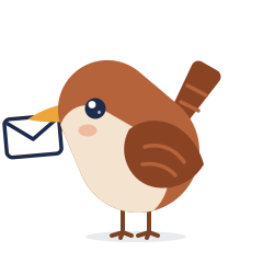
- The beakThe only warm colour in the mark, for the voice: news home, messages, a song.
- The Dusk tileA calm evening blue, the colour of home time. It carries the app and the website.
96 px48 px32 px16 pxOne family, every surface



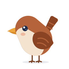
Meet the wren
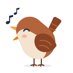
The same bird as the mark, with a little more detail. It turns up in quiet moments: an empty list, a finished job, a page that cannot be found. It never appears beside safeguarding, medical or money matters, where warmth comes from being clear.
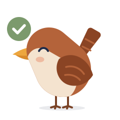
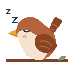
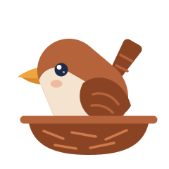














Hedgerow colours at home time
Dusk carries the brand and the interface. Wren, Moss and Eggshell are accents, so use them sparingly and never for status alone.
Dusk ramp (CSS --brand-50 to --brand-950). Text on Dusk 400 and darker is white; on 300 and lighter it is ink.
Warm display, clear interface
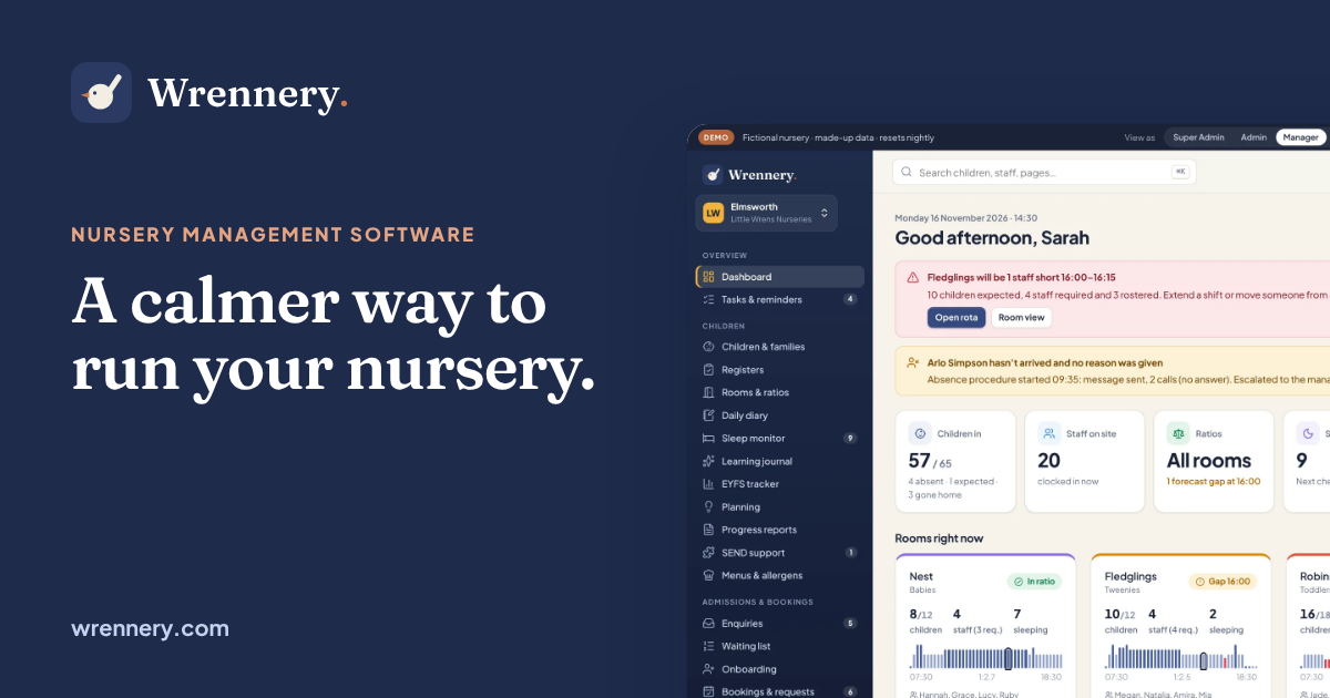
A calmer way to run your nursery.
Olivia signed in at 07:52 · Lunch: all eaten · Sleep 12:40–13:55
Like the best room leader you know
Warm, calm and organised. Wrennery talks to managers as capable professionals and to parents as people who miss their child at two in the afternoon. It is never babyish and never corporate.
Always UK English: nappies, mum, timetable, enrol, £ and half-term. No bird puns in anything about safeguarding, health or money.
Keep it clear and kind
